Welcome back! We have a new colour duo starting today at the Color Hues for Color Challenge #85!
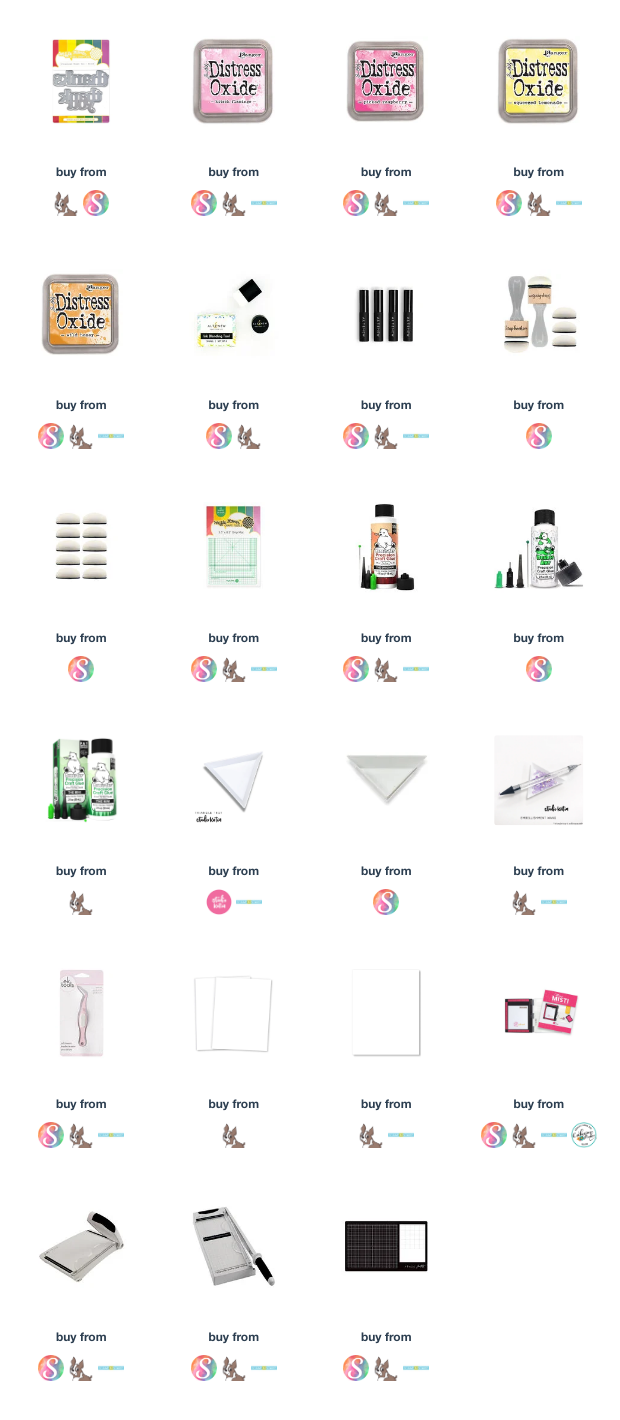
My plan for today's card was to have yellow on the top and pink on the bottom with them blended together in the middle. I used Distress Oxide Inks in Wild Honey, Scattered Straw, Picked Raspberry and Kitsch Flamingo. It made a lovely peach shade where they blended over one another in the middle. Then I laid a stencil over the ink blending once dry and sprayed Picked Raspberry Distress Oxide Spray. The nozzle did not spray smoothly and the first panel as set aside.
I ink blended another panel and did the same thing but this time I cleared the nozzle before spraying on my panel. and it turned out...BUT...although I haven't done it in along time, I glued the better panel upside-down on the card base!
The decision was made to make two cards!
The 'good' panel was now upside-down with pink on the top and yellow on the bottom. I used an older stencil by Birch Press Designs called Ring Tiles. There are other companies who have a similar stencils but really you can use just about anything. Graphic designs would likely work the best!
The sentiment in the centre is Waffle Flower Crafts Oversized Thank You Print. I cut it out three times in black and glued them together for a chunky sentiment!


12 comments :
Just great cards with this colors !!!
Thank you !
groeten Ineke
Tracey, upside-down? No! it was kismet as they are both really beautiful!
=]
Upside-down or right-side up... I love both versions, Tracey!
These are both just great, Tracey! Love your artsy creations!
Tracey, both your cards are lovely! Your seamless blending, the stenciling, the bold sentiments, the gems...a combination sure to bring joy to the lucky people receiving these!
hugs~c
If you hadn't mentioned it I wouldn't have known it was upside down! Love the soft effect you got with the spritzing over the stencil. :)
Both cards are FABULOUS Tracey and the ink blending perfect! Love just the hint of the stencil beneath all that wonderful color too! And top or bottom...doesn't matter as they both are wonderful! Love the bold sentiment too!! Well done my friend! Hugs. :0)
Beautiful use of the colors Tracey.
Don't you just love when a "mistake" turns out to be usable? An unexpected two-fer! I love these backgrounds! I find when I spray through stencils they never turn out as nice as yours did, but I'm probably too heavy-handed with the amount of spray. Fabulous, vibrant gorgeous cards, Tracey!
I enjoyed reading about the trials you had while making these cards, Tracey. As Stef mentioned, a TWO-fer is never a bad thing. I love them both! I have sprays and rarely use them as I have no control. LOL Have a great weekend!
Two great cards, hands down! Your backgrounds are beautiful and such pretty shades of pink and yellow. I love those striped gems! The spray adds such lovely texture. Fabulous card, Tracey!
Oh I LOVE these Tracey... and now you have two cards! Thanks for making my chosen colors shine so beautifully!
Post a Comment