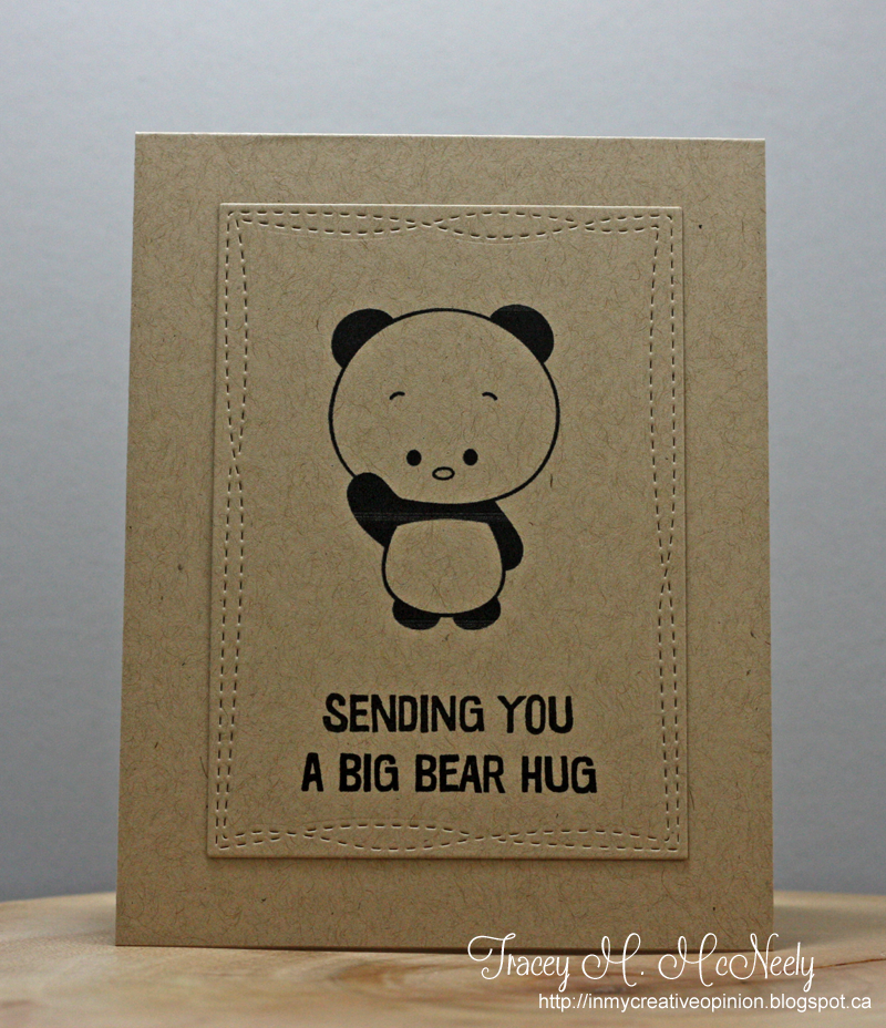
Our sponsor this week is Kitty Bee Designs and I used a cute panda image from the shop for my card today. Keeping your colours minimal has great impact in CAS design. I chose to just go with kraft and black for my card. I jazzed it up with a Wonky Rectangle from MFT Stamps.

Hop on over to the CASology blog to see what the rest of the team has made to inspire you this week.
Can't wait to see what you make...
Hannelie Bester
Sherrie Mannion
Jacquie Southas
Deidre Payne


16 comments :
He is adorable and bearry cute!
CAS perfection. That panda is adorable on kraft.
This is now my new favorite CAS card of 2016, Tracey! You've taken simple elements and made them absolutely sing with joy!! Hugs, Darnell
Oh yeah, he's CUTE alright!! Sweet card Tracey!
You've totally captured 'cute' Tracey, and CAS!
=]
Soooooooooo cute!!!!!!!!!!!!!!!!!!!!!!!!!!
I had only seen the peek, hadn't seen the cue card and said,"Aw, cute!" I think that means you nailed it!
Aww, this is so sweet. I love how you kept it simple with just kraft and black.
A perfect CAS card with the adorable bear...so cute!!
Love the kraft! Your little bear is soooo adorable!!
Tracey this is the cutest CAS card among all ! You're totally right, minimal colors give a great impact ! We just focus on this so sweet panda and the sentiment ! I love it. Thanks for sharing.
Izzy Scrap
Love the perfect simplicity of this and just using kraft instead of white makes such an impact.
Such an adorable image, and I love that you just left him in kraft and black to highlight all his cuteness!
Oh, what a 'Cutie', Tracey! I love the effect of bold black on Kraft and your Wonky stitches are perfect! Such a darling card!
Adorably cute!
This is so cute!! I LOVE the simplicity and that adorable panda and that you used!!
Post a Comment