It is time for a new Cue Card at CASology!
As always the Cue Card is left to the participants discretion, but many of the DT decided to take contrast to task and share a card that isn't CAS and then CASify it!
Here is a card I posted two years ago, when I was still struggling with what my style actually was. lthough i look at it now and still think it is a nice card. I don't think I would make a card like this again, just not my personal style.
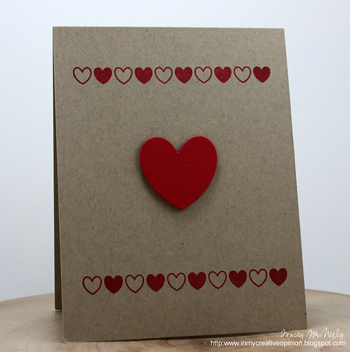
Looking at this card the first thing I new I needed to do was to simplify it. Far too much clutter for a CAS card. So the first thing I did was choose the elements that I still wanted on my new card so I wanted to keep the kraft base, I still wanted this to be a Valentines card, I still wanted red hearts and I still wanted some borders too frame my focal image.
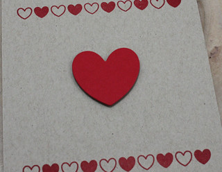
I replaced the die cut heart borders with a smaller scale stamped borders and I simplified the heart focal image to one heat only, but I popped it up for interest.
You may see this as too plain but it was what felt right for me. Other options I considered were:
1. Only the heart
2. One of the original heart borders at the top and bottom
3. Stamping the backgroud with the same argyle and adding the die cut heart
What would you have done?
Head on over to CASology today to learn what the 'cue card' means to you, how you can play along and see the all the cards created by the Design Team to inspire you.
I can't wait to see what CONTRST means to you!
Cardstock: Kraft, Pure Poppy(Papertrey Ink)
Stamps: Whole Lotta Hearts (Reverse Confetti)
Ink: Real Red (Stampin' Up)
Dies: Love Notes (Reverse Confetti)


31 comments :
Great demonstration of CAS vs non CAS - all styles can be beautiful, as these two cards show!
Wow !! lovely hearts cards :)
Both cards are fabulous Tracey. You really do CAS very well.
I love it! I might have put a sentiment at the bottom right, but I like your version just fine! I don't know why I feel like I have to have a sentiment on the front....I should think outside the box!!! I just love that little line of hearts though...trying to resist those Reverse Confetti stamps!
Love your CAS card today. It is so 'YOU'. You must have posted that other card before I knew you, because I don't remember it. You are right, that it is still nice, but definitely not your current style. I appreciate seeing your thought process about how to simplify it.
I absolutely love your CAS card Tracey - so clean and stylish. Isn't it great how our styles evolve over time? Keeps it all interesting.
Hugs
Carol x
II adore the CAS version of your card Tracey - love the heart border stamp!
Tracey, it's so fun to see where your cards were then and now...I love both but I really LOVE your CAS version. Beautiful!
Fantastic Tracey!!! Love this CAS card Simply Beautiful :)
Tracey, I like the new card...simple is really who you are, I think. The only thing I would do is add a "love you" on the face of the card, but that is just me...Love your card either way! thank you for your thought process...!!
Oooooh the second one is SO YOU Tracey!! Love the way you simplified it. Very cute!!
Both cards are so sweet! :) I'm really lovin' your CAS card...simply, perfect!
I like both as well. My CAS-lovin' heart favours the second one of course!
What a stunning CASification of your first card, Tracey ... fabulously simple and gorgeous! Anita ;)
Wow, stunning seems less to describe how much I love this one :)
It's funny because when I opened this in my feedly feed I quickly looked to see whose blog it was before scrollig down to check out the pics. When I saw that older card I had to go back up and make sure I read the name right because it didn't look like you! Love your redesign!
I have never seen you put so much on a card! Love how you took your original card and cleaned it up, not that it was dirty, haha! Great lesson Tracey!
Now how fun are BOTH of your cards...super fun! I really enjoyed playing with you all...perhaps I'll try to squeeze in some time to make a non-CAS of my card today.
loving all those hearts.. i love this card..
Beautiful!! LOVING the hearts!!!!!
Brilliant! And I loved your mini-lesson, too. You're the best!
I love your updated version… You have come a long way! JK you have always been a wonderful card maker. Love the difference in both. TFS
A wonderful cas design! Love the hearts on the kraft! Interesting to see your previously made card!
Both cards are really beautiful, but I have to say, your new one is AMAZING! I wouldn't change a thing, and I love that you didn't add a sentiment on the front...it's perfect!
Thanks for sharing this with us, and for explaining your process!
Fabulous take on your own design. I love the CAS design and of course the red and kraft combo is amazing!
What a fun post, Tracey!! Love your idea to remake an earlier card of yours, and point out your ideas on making it CAS. Everyone loves a before and after shot! And the after here is exactly your style. Wonderful!
Your case of your card to make it more the 'current cas' you: fabulous! LOVE the kraft/red combination and your heart selections...gorgeous!
c
Aah! This is more like the Tracey we've all grown to love!
Wow! I really love the contrast of the red and kraft colours on your CAS card. It's gorgeous!! :)
Wonderful CAS contracts and examples in the meanings!!! Cards Rock too!!! 9(specially the CAS LOL!!!)
Wow! Love the CAS card and the comparison with the non-CAS card is striking!
Post a Comment