We have a new color duo over at the the Color Hues Color Challenge #62! Chosen by talented teammate Cindy I think your going to like this one!

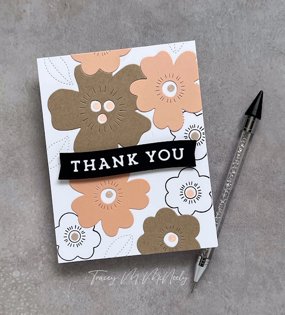
For the tulips on the card I used the BotaniCuts Tulips dies and the Market Basket dies from The Greetery. These tulips make me smile every time I use them. I blended Shaded Lilac and Villainous Potion Distress Oxide inks for the flowers and Twisted Citron, Mowed Lawn and Rustic Wilderness for all the greenery.
TIP: Placing your die cuts on a sticky mat for ink blending is very helpful when ink blending.

I cut the largest Market Basket with Mirror gold cardstock. I needed to trim the basket a wee bit to fit in with my overall design--so easy. You probably wouldn't have noticed if I hadn't pointed it out--lol!
I added a few detail strokes to the flowers with pencil crayons, if you are Canadian you likely know what I mean. In the U.S. I believe they are colored pencils. What do you say?

The label on the front of the basket uses a sentiment also from The Greetery called Market Basket Sentiments.
I made a last minute decision to leave the front of the card without a sentiment to describe the type of card it is. I like to always have cards like that on hand, you never know what you might need in a pinch.
Thanks so much for stopping in today and please head over to the Color Hues to see what the rest of the design team has made to inspire you!