
Hi there crafty friends! Today we start a new colour duo at the Color Hues Color Challenge #87!
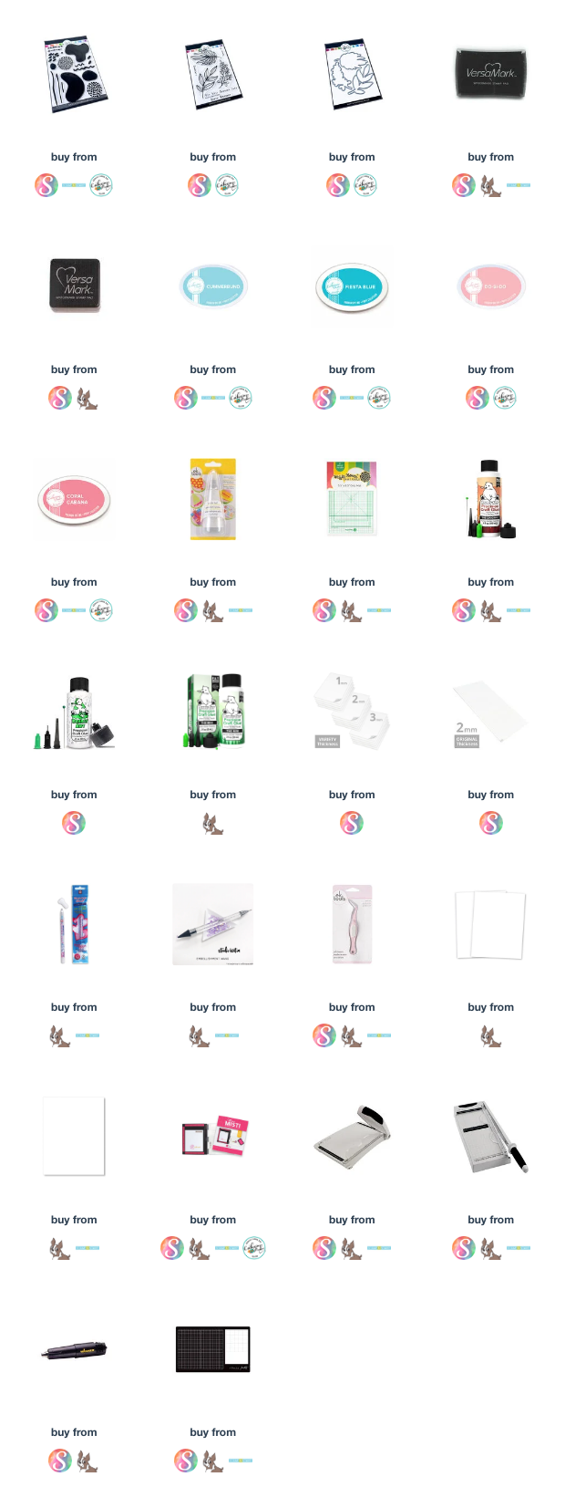
I used a couple of my favourite sets from Catherine Pooler. I used Bold Bits & Patterns and Natural Flourishes for my card. I love how you can be creative and use the shapes and patterns along with the fabulous outline leaf images in any way that moves you!


I used Catherine Pooler inks for my card. I chose two hues of coral and two hues of Teal--Cummerbund, Fiesta Blue, Do-Si-Do and Carol Cabana! I love the way CP inks fade and soften as they dry.

I cut the panel down to 5" x 3 3/4" and attached it to my card base using foam tape.

I stamped the Happy Birthday sentiment from Catherine Pooler's Natural Flourishes using VersaMark ink on black cardstock and heat embossed using WOW Opaque Bright White Super Fine embossing powder. It was trimmed down and added with foam tape strips behind it.

We have likely all done this before, make a card and then get a smudge on it. My first card I smudged, so sad because it turned out just as I had planned. So I set it aside while I remade the main card. I went back to the smudge and cut the panel down to make 4-Bar card. So easy to do, cut a 5" x 7" piece of cardstock for your base, score it at 3 1/2".

These were such fun cards to make!

Thank you for stopping by and please visit the Color Hues Challenge blog, My teammates have outdone themselves again!
Tracey, I think that smudge was a happy accident; now you have two delightful, stylish, artsy cards to send. Double the joy for the lucky recipients! Your hues of coral and teal are soooo pretty!
ReplyDeleteHugs and love (and yes, we really really really need to plan a phone chat!).
~c
Oh Tracey...I absolutely LOVE both of your cards! I'm already trying to think of stamps I already have that could replicate a card like this! It's graphic, it's fun, it's bold, and I just love, LOVE the design! You have totally made these challenge colors SHINE my friend!! Hugs. :0)
ReplyDeleteGorgeous -gorgeous- ALL the design teams are cards are so inspiring!!
ReplyDeleteYOUR colors are perfect!!! I struggled a little....
I played along too -Thanks for sharing your creativity!!
-Kimberly W
tracey, I love the design you came up with for the stamping. It is fabulous a 70's feel but with great updated colors. Fantastic card.
ReplyDeleteGraphic gorgeousness, my friend! OH, do I love these colors!
ReplyDelete=]
I am quite sure I could have never combined those stamps to create such beautiful designs! I love both cards. I'm a huge fan of graphic cards, and I'm pinning these so I can remember to be more adventuresome with my stamps!
ReplyDeleteLoving the retro feel of these cards Tracey. The colours work so well with the MCM stamps and foliage. :)
ReplyDeleteYour design is absolutely fabulous on both cards Tracey, and now you have two to share! I'm definitely in Karen's camp, I would not have thought to create such a wonderful combination of elements. Love this!
ReplyDeleteThese are such fun cards to see, Tracey! Fabulous designs, perfectly balanced and great colors!
ReplyDeleteTracey, your card is so bright, graphic and fun. It's so fresh looking.
ReplyDelete