

It's time for a new challenge at CASology!
This week our Cue Card is:

This is also for Day 23 of Kathy Racoosin's 30 Day Coloring Challenge at The Daily Marker.com!

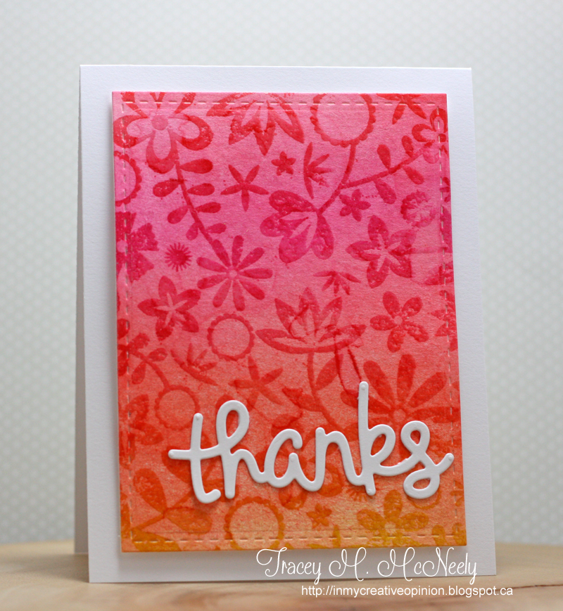
I watched Jennifer McGuire's video on Watercolour Lifting and I had to give it a try. It seems lately I have been reaching for watercolours before ink--lol The technique is really fun to do. I started by sponging four different Distress Inks onto a watercolour panel, then added water, then clear embossing my background and added more water.
Not sure if the colours are a bit too bold for CAS design but I was so pleased with how it turned out I let it be the main panel. Then just added a simple plain white sentiment so it didn't fight with the background.

Head over to CASology to see what the rest of the Design Team created this week. Hope to see you play along with us.


I LOVE this! The colors are just gorgeous together! that background is fabulous!!
ReplyDeleteGorgeous rich colour and texture! I see we have the same Lawn Fawn supplies! lol!
ReplyDeleteI saw Jennifer's video and cards the other day and I cannot wait to try this myself. Love how your card turned out, Tracey.
ReplyDeleteOh, this is beautiful!!
ReplyDeleteAbsolutely gorgeous. I was wondering how you did this. Really amazing.
ReplyDeleteTracey, I love this! I haven't seen Jennifer's video, so thanks for sharing a link. If it turns out like this, I'm going to have to watch it!! Great call on the simple white sentiment.
ReplyDeleteSuch beautiful vibrant colors and the pop of white is perfection. Fabulous card.
ReplyDeleteLove all the color Tracey.
ReplyDeletewow that background is awesome.. such a pretty card
ReplyDeleteSo gorgeous!!!!!!!!!!!!!!!!
ReplyDeleteI want to try this technique, too! You have totally rocked it here, Tracey! And why can't CAS be bright and bold?
ReplyDeleteIncredibly beautiful Tracey!!!
ReplyDeleteWonderful card! I love the colors and you did a fantastic job on the "ink lifting"!
ReplyDeleteWow, Tracey ... what a stunner ... the white sentiment is the perfect complement to those delicious vibrant colours! Hugs, Anita :)
ReplyDeleteOooooh so pretty! That background is stunning!!
ReplyDeleteI keep hearing about this technique and I'm going to have to check it out because your card is gorgeous and I want to try it! I love those bright, happy colours!
ReplyDeleteGorgeous background Tracey! I'm loving distress inks lately and have watching Jennifer's video on my 'to-do' list.
ReplyDeleteI love how you used Jennifer's technique on your background and your embossed flowers and leaves are so pretty! Fabulous scripty sentiment, too! Thanks for reminding us that 'white space' doesn't have to be white!
ReplyDeleteWhat a gorgeous background. I love this Tracey.
ReplyDeleteOooh, I love this!! What a fab technique! That's one I need to try too! LOVE your palette!!
ReplyDeleteI'm right there with you reaching for watercolors before ink, too. I saw this video and so want to give it a try. You've totally done right by it! Absolutely beautiful, and so full of delicious color!
ReplyDelete